Odyssey
Scroll to find out more
A brand new Odyssey
People are at the heart of everything that Odyssey does. Since 1980, Odyssey has helped thousands of New Zealanders to overcome alcohol, drug and gambling addiction problems.
Odyssey holds a position of leadership in the sector and in the lives of service users, and takes this responsibility seriously. To echo this position, Curative worked to establish a refreshed brand to reflect Odyssey’s expertise, while continuing to centre around the people and emotions that affect those dealing with addiction.

On a journey together
As an established service with deep relationships with tangata whaiora and staff, we knew that we needed to bring Odyssey’s people with us on any journey of change.
We undertook a co-design process which included approximately 70 staff, service users and the leadership team. Through this process we explored the expression of their vision, mission, values and the pillars of Odyssey.
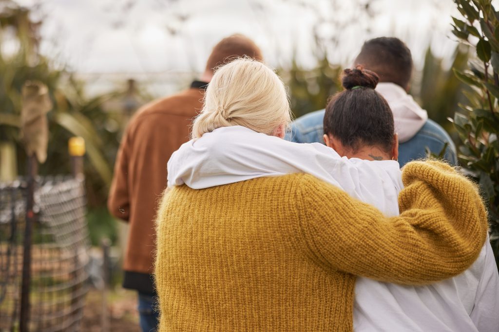
Bringing people into the process aligned deeply with what we heard in our sessions together; the team at Odyssey are there to make a difference and go on a journey with service users, and it takes everyone working together to create real change.
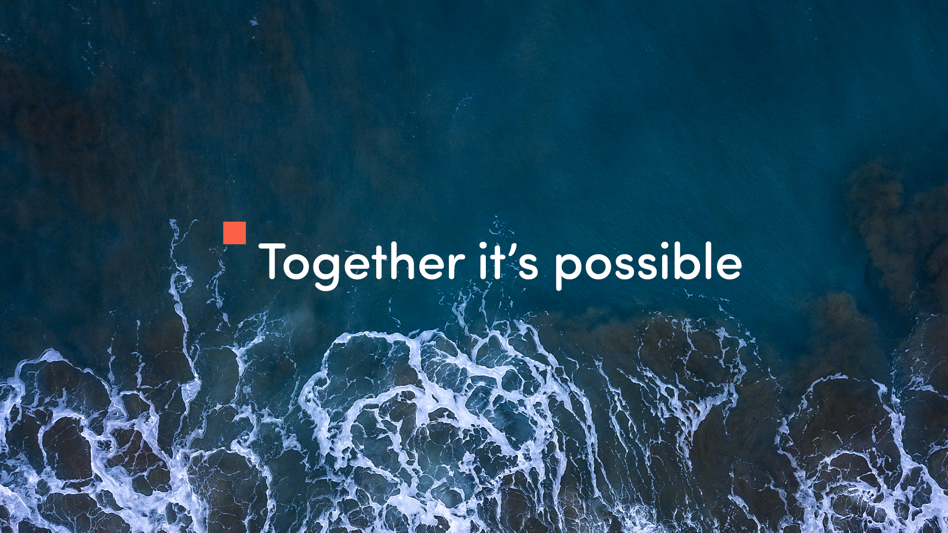
The power of connection
Our work revealed an appetite across the organisation to contemporise the way that the brand is expressed to bring Odyssey’s values to life more fully. This included showing the hope and passion within the team, highlighting the power of connection and empowerment, reflecting diversity and highlighting the flexibility to respond to people wherever they are on their journey.
Seeing the horizon line
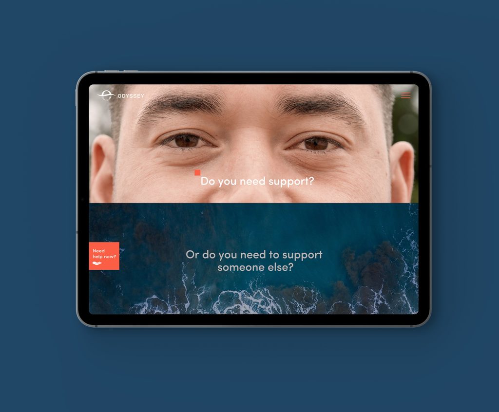
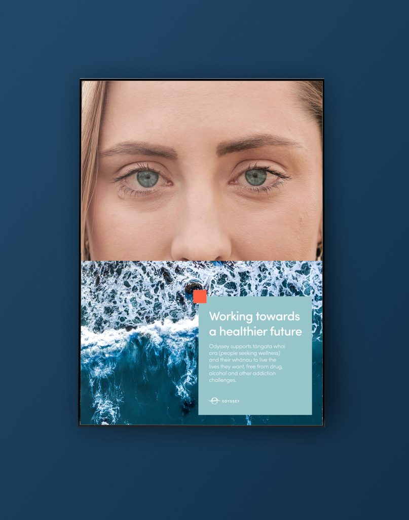
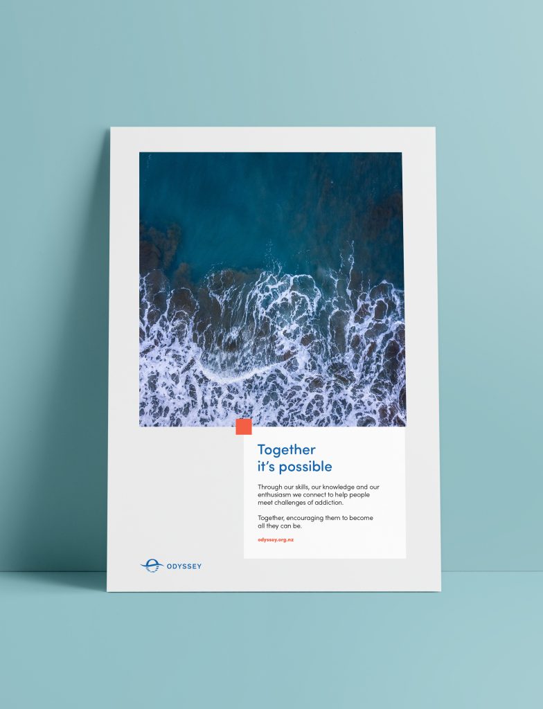
There was clear direction to use the existing logo mark, but opportunity to update the visual language to tell the story of Odyssey. The existing mark unlocked a wealth of meaning; the sun emerging from the ocean, with new hope on the horizon line, creating a sense of being refreshed, renewed or emerging to a new day.
Creating a pivot point
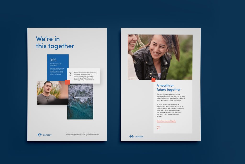
The updated brand expression for Odyssey focuses on four key components; People, Oceans, Horizons, and a Pivot Point.
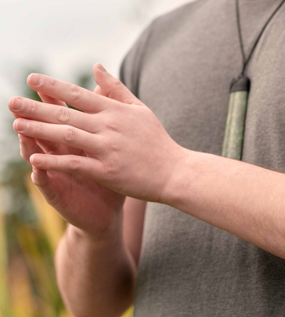
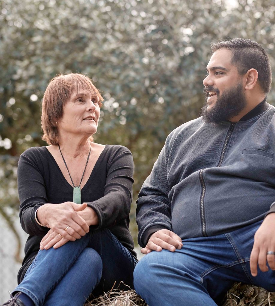
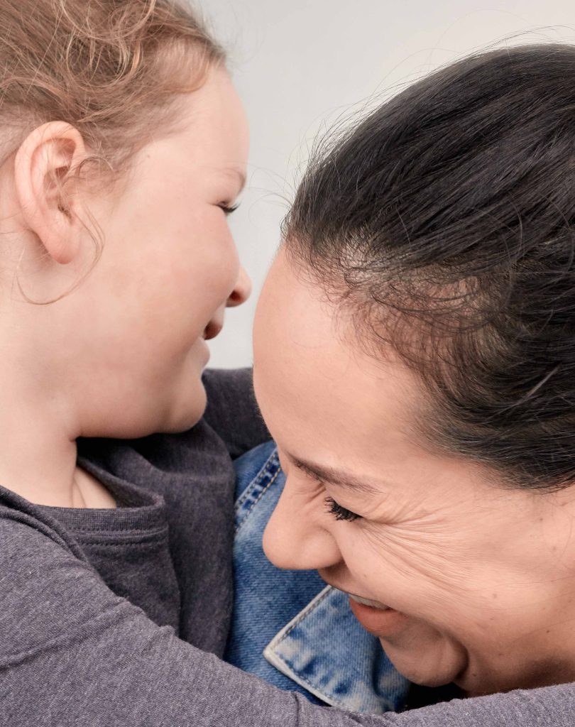
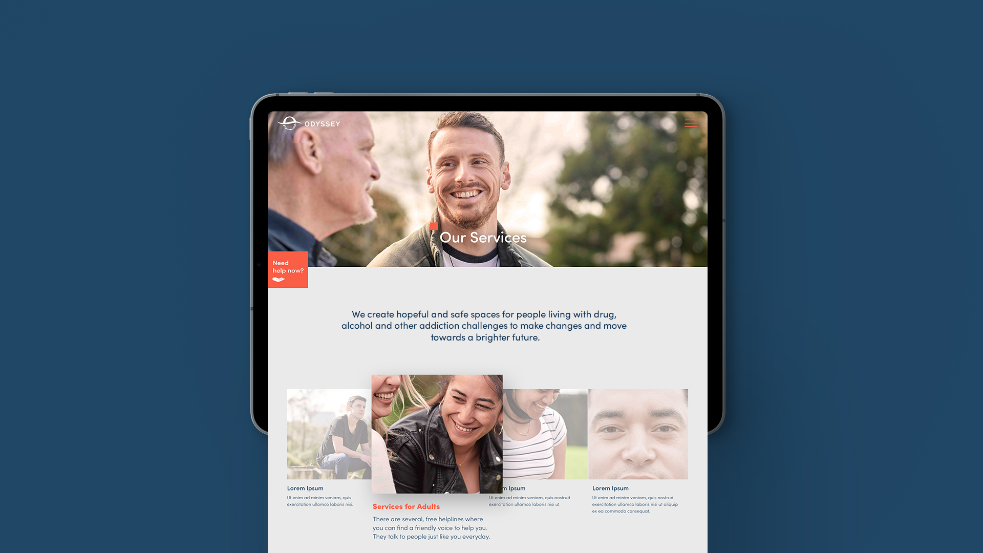
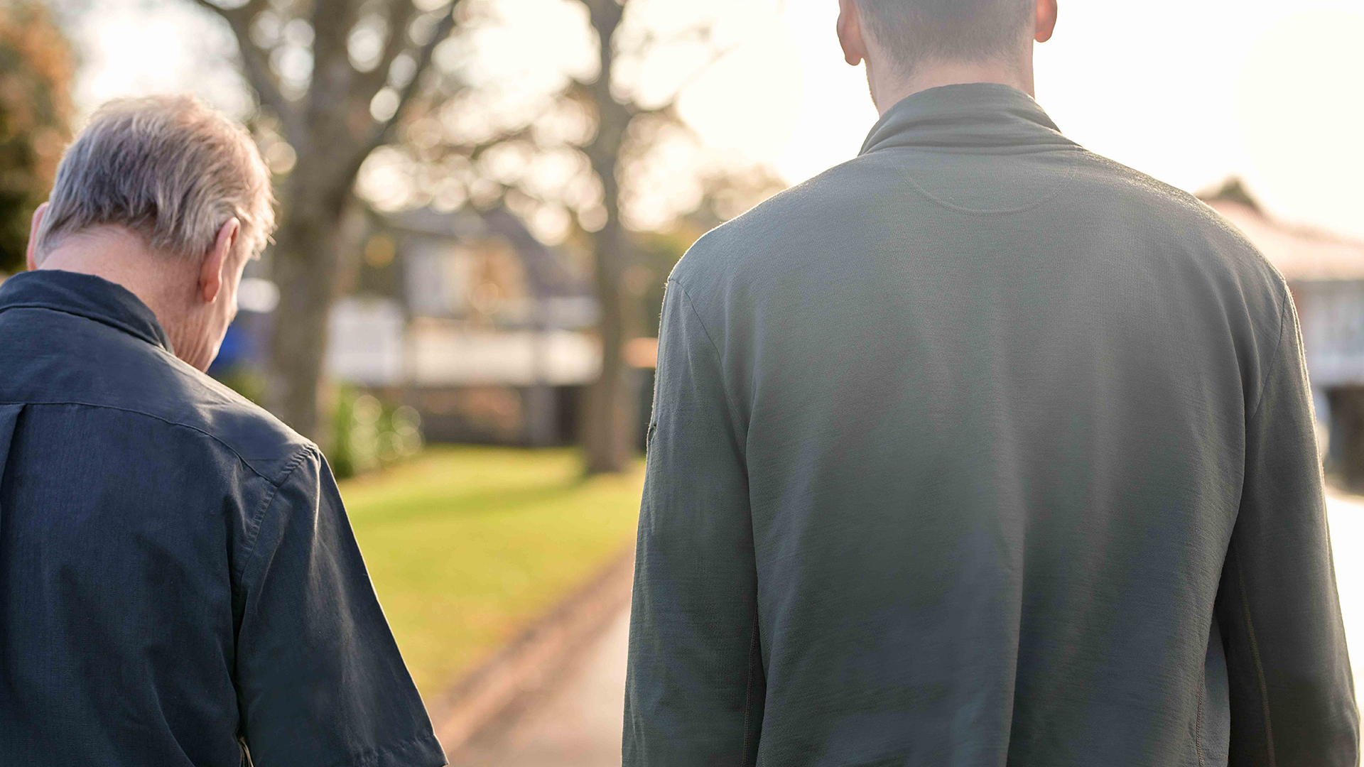
People are at the forefront of everything that Odyssey does. To reflect this we crafted a new photographic library, reflecting the diversity of staff and service users. The photography used heavily features tight crops of people’s eyes, a small window into the emotions of our individual journeys. Human imagery is used alongside different shots of the ocean; a place of feeling and shifting waters – sometimes rough, sometimes calm – echoing the experiences of the Odyssey community.
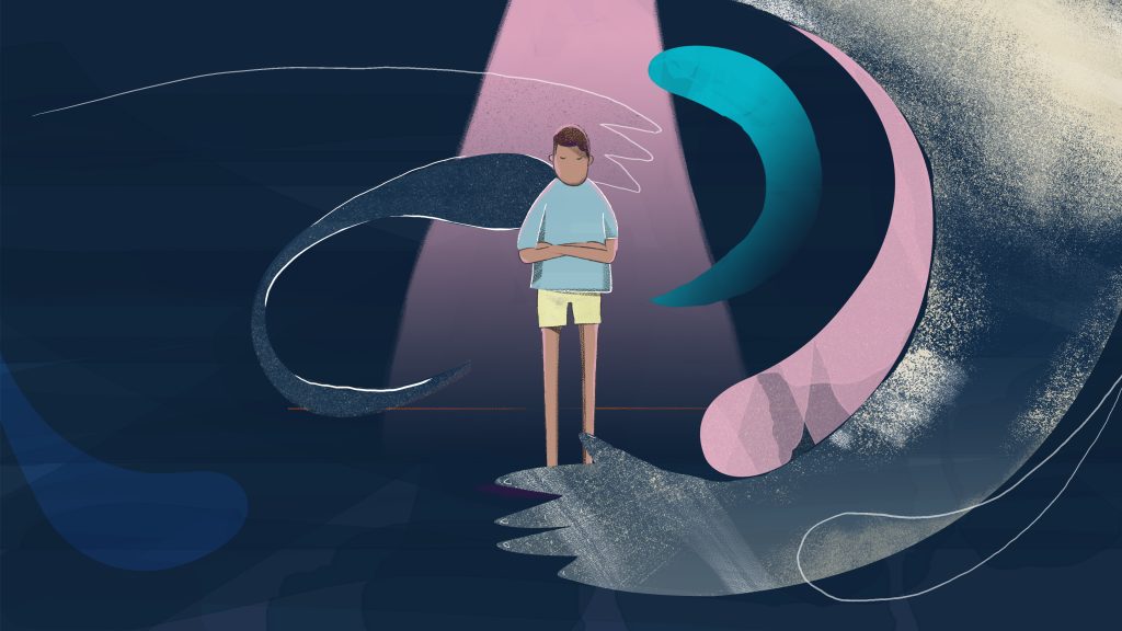
Odyssey Youth
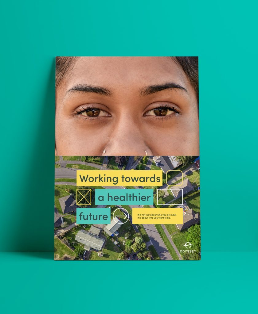
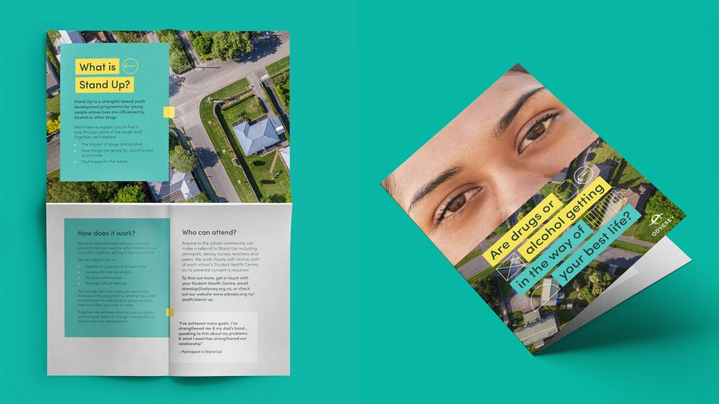

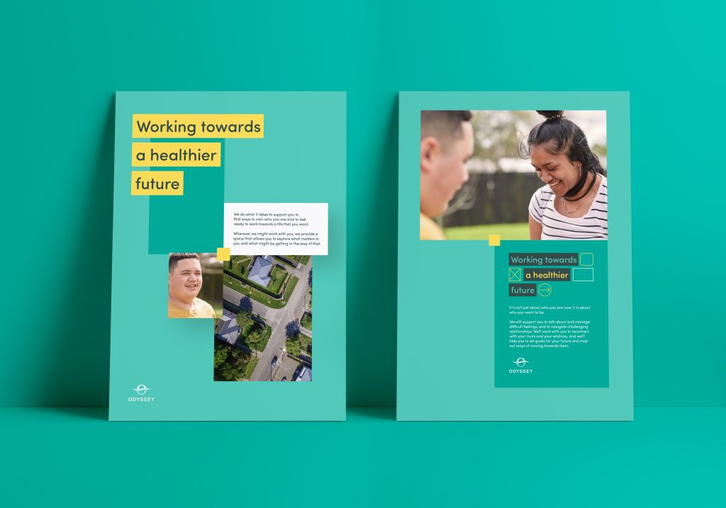

The pivot point has also been introduced as a visual punctuation that anchors various pieces of information and imagery together. This reflects the moments of change that can occur within someone’s personal journey.
Confidence and Connection
The refreshed brand for Odyssey reflects the confidence and position of the organisation. The team expressed that the brand now feels more connected to the values, mission, purpose and pillars of Odyssey and people can clearly see themselves and their journeys in the way that the brand communicates.