Higher Ground
Scroll to find out more
A fresh approach for a well-loved brand
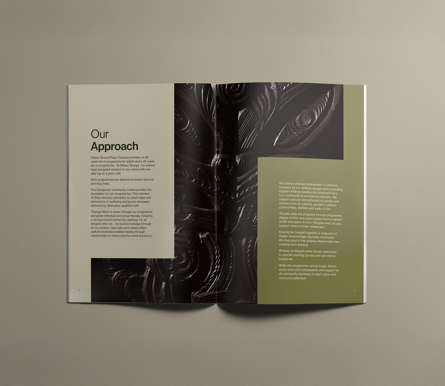
The Higher Ground Drug Rehabilitation Trust was established in Auckland in 1984 and provides rehabilitation programmes that are based on 12-step recovery principles and evidence-based therapies.
As 40 years had passed since the foundation of Higher Ground, the team were keen for a new brand identity to better reflect the valued work that they do.
A strong reputation
To understand what a better brand experience might look and feel like, we held several bespoke workshops with a range of people closely connected with Higher Ground. We asked those who knew this place so well to describe Higher Ground like they’d describe a person.
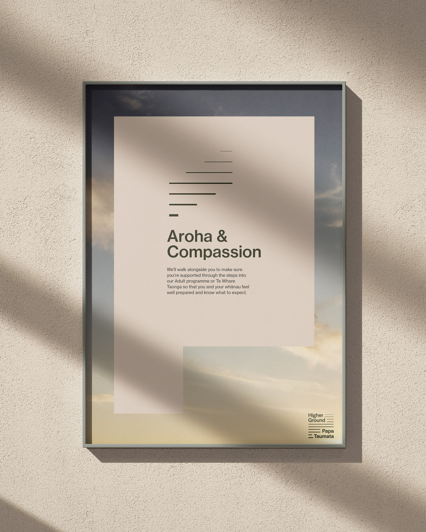
We heard consistently that Higher Ground is a place that balances a constant duality: direct communication and firm boundaries, yet within a context of kindness and empathy.


We heard about Higher Ground’s formidable reputation in the community, which is partly evident through the retention staff and the number of residents who become staff.
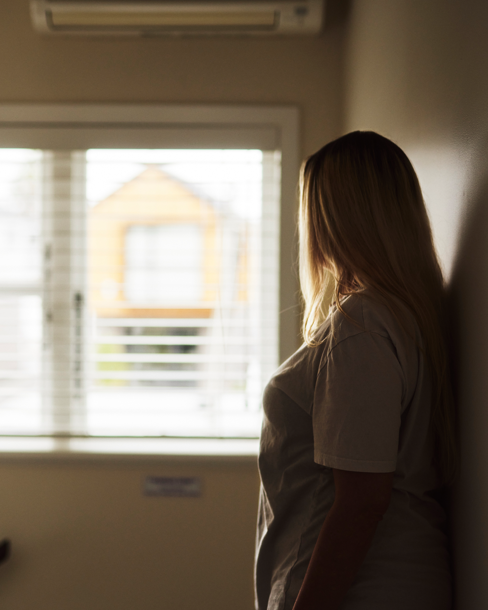
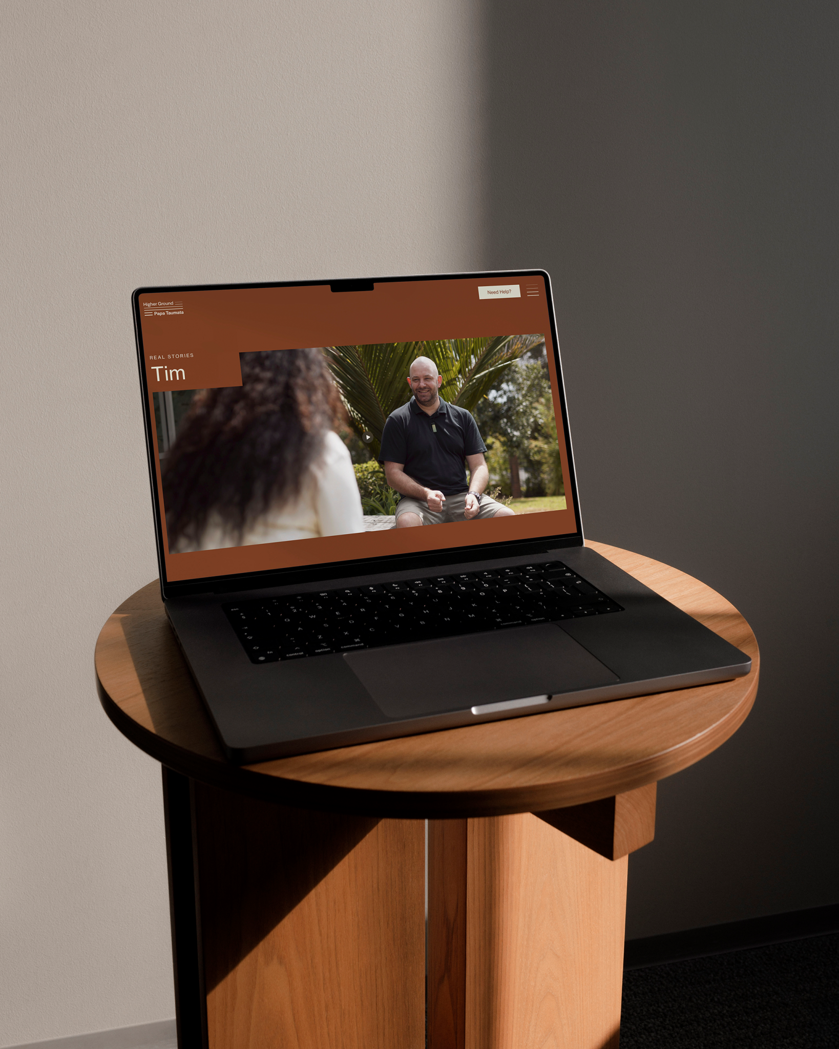
And we heard powerful stories of transformation and hope: journeys from the depths of crisis to a new life. Higher Ground enables its residents to realise a future without addiction.
Capturing transformational experiences
Throughout our insight-gathering process it became clear what a well-respected and much-loved organisation Higher Ground is. We saw many opportunities to convey and honour this in our creative approach.
We wanted to inject the brand with the warmth that was so present in so many of our conversations about Higher Ground. Inspired by many stories of support and manaaki, we wanted to take the brand’s appearance from straightforward and formal, to inclusive and inviting. We also heard how Higher Ground puts a strong emphasis on a relationship with nature as part of the healing process and we wanted to ensure this was reflected.
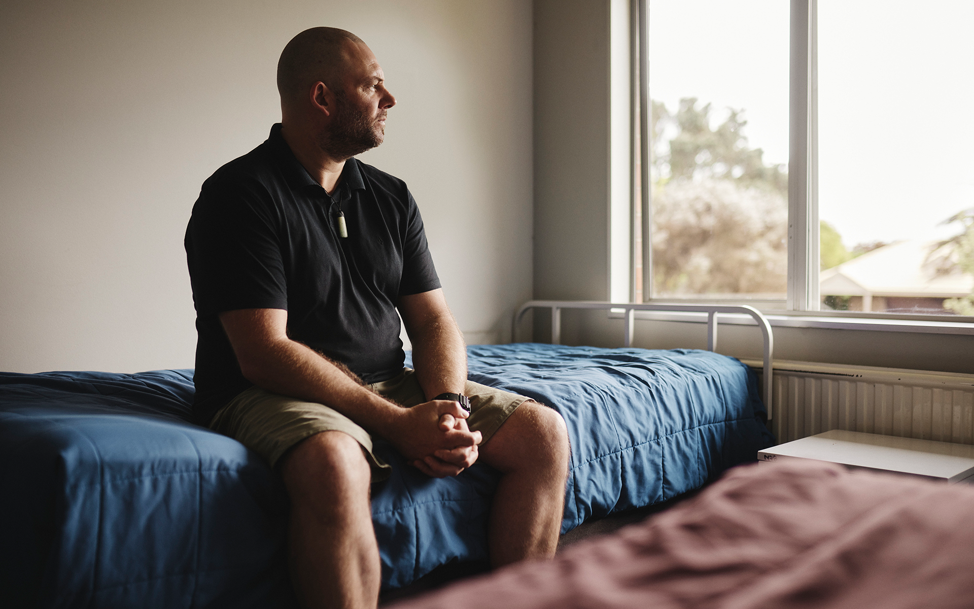
It was clear to us that the power of the stories we heard weren’t currently visible to potential residents. With Higher Ground, we agreed that hearing real stories of transformation would reassure some of the fears of what Higher Ground was like, and what it could do. Platforming these stories would also bring a human-centred realism in the new brand and website. Along with the design approach, it would help transform what had been a slightly generic and clinical tone of communication to honest, human and accessible.
That accessibility was also going to be key in the way information was organised throughout the website and communications. While we wanted to elevate the brand to honour its reputation, we knew that our creative approach had to remain straightforward, grounded and simple in order to connect with its audience and not alienate them.
Lastly we knew it would be important to consider the positioning of both the reo Pākehā and reo Māori names of the organisation, conveying the balance that’s present between these two worlds in everything the organisation does.


Stepping into recovery
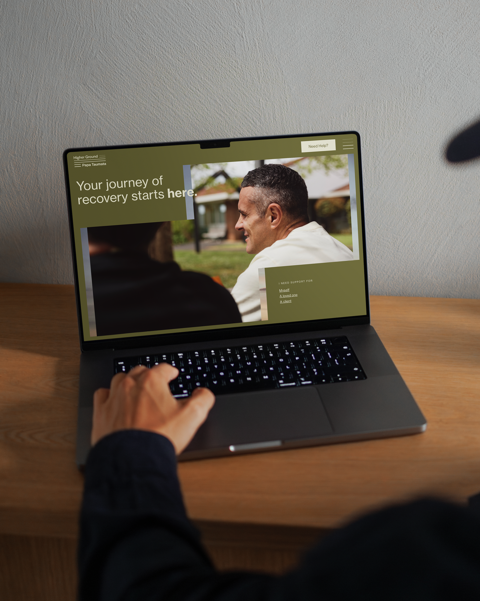
The creative approach for this brand is deeply anchored in the varied meanings behind the name Higher Ground | Papa Taumata. It evokes the idea of a journey, an ascension from one plane to another. From heavy to light, from low to high, from darkness to lightness. The recovery journey holds all of these opposites, together. This duality is the strength of the Higher Ground brand.
Our logo visualises the meaning found within the name Higher Ground. It uses a stylised Poutama to illustrate the individual steps that each tangata whai ora takes on their journey to wellness. Like the Poutama, the logo uses multiple strokes to illustrate the support each individual receives, and acknowledges that often it is more than just the tangata whai ora who are invested in the journey.


Both the English and Māori names are positioned equally in the natural stepped composition and the way the organisation’s processes connect tangata whai ora to the natural world is reflected in the colour palette. The brand utilises earth tones to add warmth and create a calm, clear space for our typography.
The stepped composition inspired by the Poutama that’s found in the logomark continues throughout the design approach. This offers a structure that leads the viewer through our communications, creating a hierarchy for information and providing windows to house imagery.
In order to connect its audience with the experiences of real people who have been on the Higher Ground haerenga, the website now features interviews that we filmed featuring tangata whai ora speaking honestly to their own journeys.

Those who step through the doors of this much-loved institution experience journeys of transformation – stepping up from hard times to higher ground.
Higher Ground is much more than a clinic. Now it’s wrapped in a brand that, through design and storytelling, authentically represents this whānau of support.
